
Pottermore brand identity and tone of voice
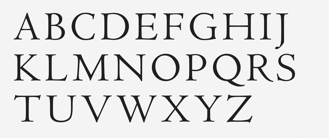
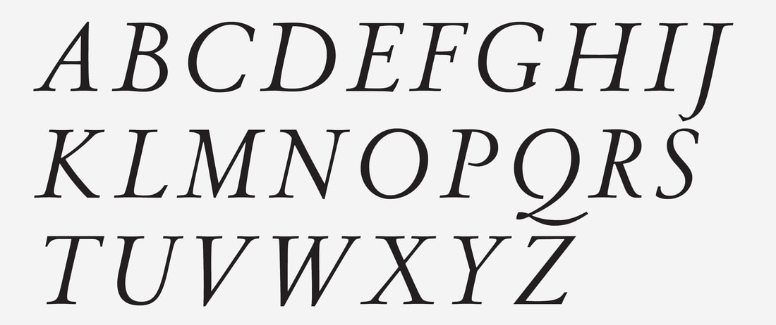
The first step to relaunching Pottermore was to establish the backbone of the brand with a new identity, logo, brand photography and tone of voice. It needed to transform into a content driven mobile first platform. The ‘The Digital Heart of the Wizarding World’. For authenticity and authority, we asked J.K. Rowling to lend her handwriting to the creation of the logo. We created a typeface, which was inspired by 15th-century Renaissance type forms. Using macro and abstract brand photographs, we created a mix of authentic photographic elements from the Wizarding World. I then established a new tone of voice and brand guidelines for the quintessentially British brand.
'You can laugh! But people used to believe there were no such things as the Blibbering Humdinger or the Crumple-Horned Snorkack!' –Luna Lovegood
|
|